
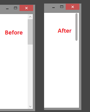
Apple MacOS has beautiful rounded corner scrollbar and add to the UI experience you have while working on a MacOS machine. You can easily have similar scrollbar style for your WPF application to boost up your application's UI experience.
If you wish to apply this scrollbar style application wide then you should follow below steps.
Step: Create a new resource dictionary (skip creating if you already have one) file and add the following code to it.
<Style x:Key="ScrollBarTrackThumb"
        TargetType="{x:Type Thumb}">
    <Setter Property="Template">
        <Setter.Value>
            <ControlTemplate TargetType="{x:Type Thumb}">
                <Grid x:Name="Grid">
                    <Rectangle HorizontalAlignment="Stretch"
                                VerticalAlignment="Stretch"
                                Width="Auto"
                                Height="Auto"
                                Fill="Transparent" />
                    <Border x:Name="CornerScrollBarRectangle"
                            CornerRadius="5"
                            HorizontalAlignment="Stretch"
                            VerticalAlignment="Stretch"
                            Width="Auto"
                            Height="Auto"
                            Margin="0,1,0,1"
                            Background="{TemplateBinding Background}" />
                </Grid>
                <ControlTemplate.Triggers>
                    <Trigger Property="Tag"
                                Value="Horizontal">
                        <Setter TargetName="CornerScrollBarRectangle"
                                Property="Width"
                                Value="Auto" />
                        <Setter TargetName="CornerScrollBarRectangle"
                                Property="Height"
                                Value="6" />
                    </Trigger>
                </ControlTemplate.Triggers>
            </ControlTemplate>
        </Setter.Value>
    </Setter>
</Style>
<Style TargetType="{x:Type ScrollBar}">
    <Setter Property="Stylus.IsFlicksEnabled"
            Value="false" />
    <Setter Property="Foreground"
            Value="#ADABAB" />
    <Setter Property="Background"
            Value="Transparent" />
    <Setter Property="Width"
            Value="7" />
    <Setter Property="Template">
        <Setter.Value>
            <ControlTemplate TargetType="{x:Type ScrollBar}">
                <Grid x:Name="GridRoot"
                        Width="7"
                        Background="{TemplateBinding Background}">
                    <Grid.RowDefinitions>
                        <RowDefinition Height="0.00001*" />
                    </Grid.RowDefinitions>
                    <Track x:Name="PART_Track"
                            Grid.Row="0"
                            IsDirectionReversed="true"
                            Focusable="false">
                        <Track.Thumb>
                            <Thumb x:Name="Thumb"
                                    Background="{TemplateBinding Foreground}"
                                    Style="{DynamicResource ScrollBarTrackThumb}" />
                        </Track.Thumb>
                        <Track.IncreaseRepeatButton>
                            <RepeatButton x:Name="PageUp"
                                            Command="ScrollBar.PageDownCommand"
                                            Opacity="0"
                                            Focusable="false" />
                        </Track.IncreaseRepeatButton>
                        <Track.DecreaseRepeatButton>
                            <RepeatButton x:Name="PageDown"
                                            Command="ScrollBar.PageUpCommand"
                                            Opacity="0"
                                            Focusable="false" />
                        </Track.DecreaseRepeatButton>
                    </Track>
                </Grid>
                <ControlTemplate.Triggers>
                    <Trigger SourceName="Thumb"
                                Property="IsMouseOver"
                                Value="true">
                        <Setter Value="{DynamicResource ButtonSelectBrush}"
                                TargetName="Thumb"
                                Property="Background" />
                    </Trigger>
                    <Trigger SourceName="Thumb"
                                Property="IsDragging"
                                Value="true">
                        <Setter Value="{DynamicResource DarkBrush}"
                                TargetName="Thumb"
                                Property="Background" />
                    </Trigger>

                    <Trigger Property="IsEnabled"
                                Value="false">
                        <Setter TargetName="Thumb"
                                Property="Visibility"
                                Value="Collapsed" />
                    </Trigger>
                    <Trigger Property="Orientation"
                                Value="Horizontal">
                        <Setter TargetName="GridRoot"
                                Property="LayoutTransform">
                            <Setter.Value>
                                <RotateTransform Angle="-90" />
                            </Setter.Value>
                        </Setter>
                        <Setter TargetName="PART_Track"
                                Property="LayoutTransform">
                            <Setter.Value>
                                <RotateTransform Angle="-90" />
                            </Setter.Value>
                        </Setter>
                        <Setter Property="Width"
                                Value="Auto" />
                        <Setter Property="Height"
                                Value="8" />
                        <Setter TargetName="Thumb"
                                Property="Tag"
                                Value="Horizontal" />
                        <Setter TargetName="PageDown"
                                Property="Command"
                                Value="ScrollBar.PageLeftCommand" />
                        <Setter TargetName="PageUp"
                                Property="Command"
                                Value="ScrollBar.PageRightCommand" />
                    </Trigger>
                </ControlTemplate.Triggers>
            </ControlTemplate>
        </Setter.Value>
    </Setter>
</Style>
Step: Add reference of your newly created resource dictionary in your App.xaml file, it should be something to this:
<Application x:Class="SampleApplication.App"
             xmlns="http://schemas.microsoft.com/winfx/2006/xaml/presentation"
             xmlns:x="http://schemas.microsoft.com/winfx/2006/xaml"
             StartupUri="MainWindow.xaml">
    <Application.Resources>
        <ResourceDictionary>
            <ResourceDictionary.MergedDictionaries>
                <ResourceDictionary Source="DictionaryContainingScrollbarStyle.xaml" />
            </ResourceDictionary.MergedDictionaries>
        </ResourceDictionary>
    </Application.Resources>
</Application>
Done !!
You will observere your scrollbar are rendered similar to the one I have shown in above screenshot.
Happy coding !!